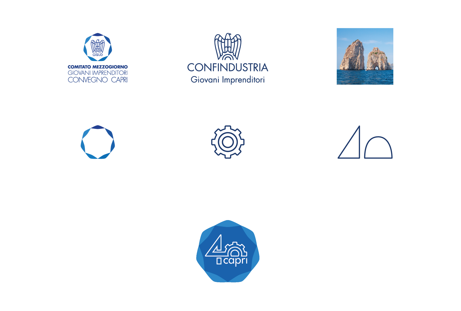
Identity for the 40th Conference of the Young Entrepreneurs of Confindustria
Celebratory Logo - 40th anniversary
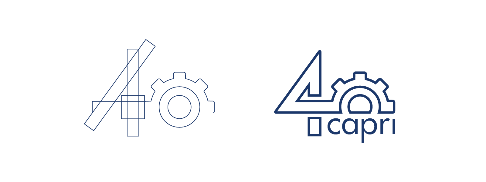
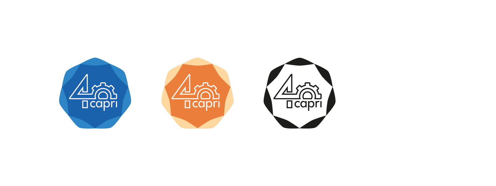
The logo created for the 40th edition of the Capri Conference is built around two symbolic elements: the circle, representing community and collaboration, and the gear, evoking ingenuity and the spirit of innovation that characterises Italian entrepreneurship. These elements are central to the visual identity of Confindustria and the Mezzogiorno Committee.
The number 40 emerges from the fusion of the stylised silhouette of the Faraglioni - iconic symbols of the island of Capri - with the graphic components of the gear and the circle. The result is a visual mark that creates a strong connection between territory and enterprise. The shades of blue, light blue, and white recall the sea of Capri, while also expressing openness and innovation—qualities essential for interpreting the challenges of both the present and the future.
The logo becomes a visual manifesto of the principles that animate the conference: dialogue between businesses, institutions, and local communities.
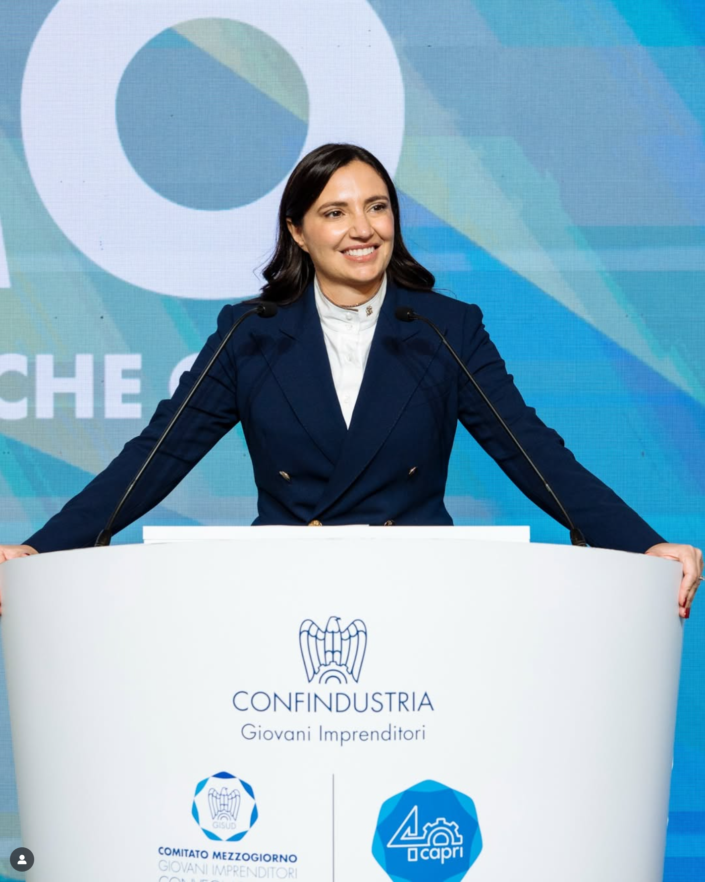
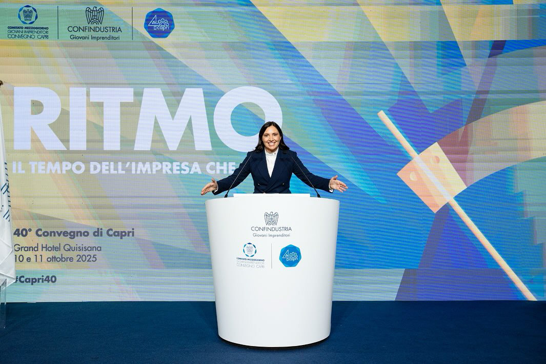
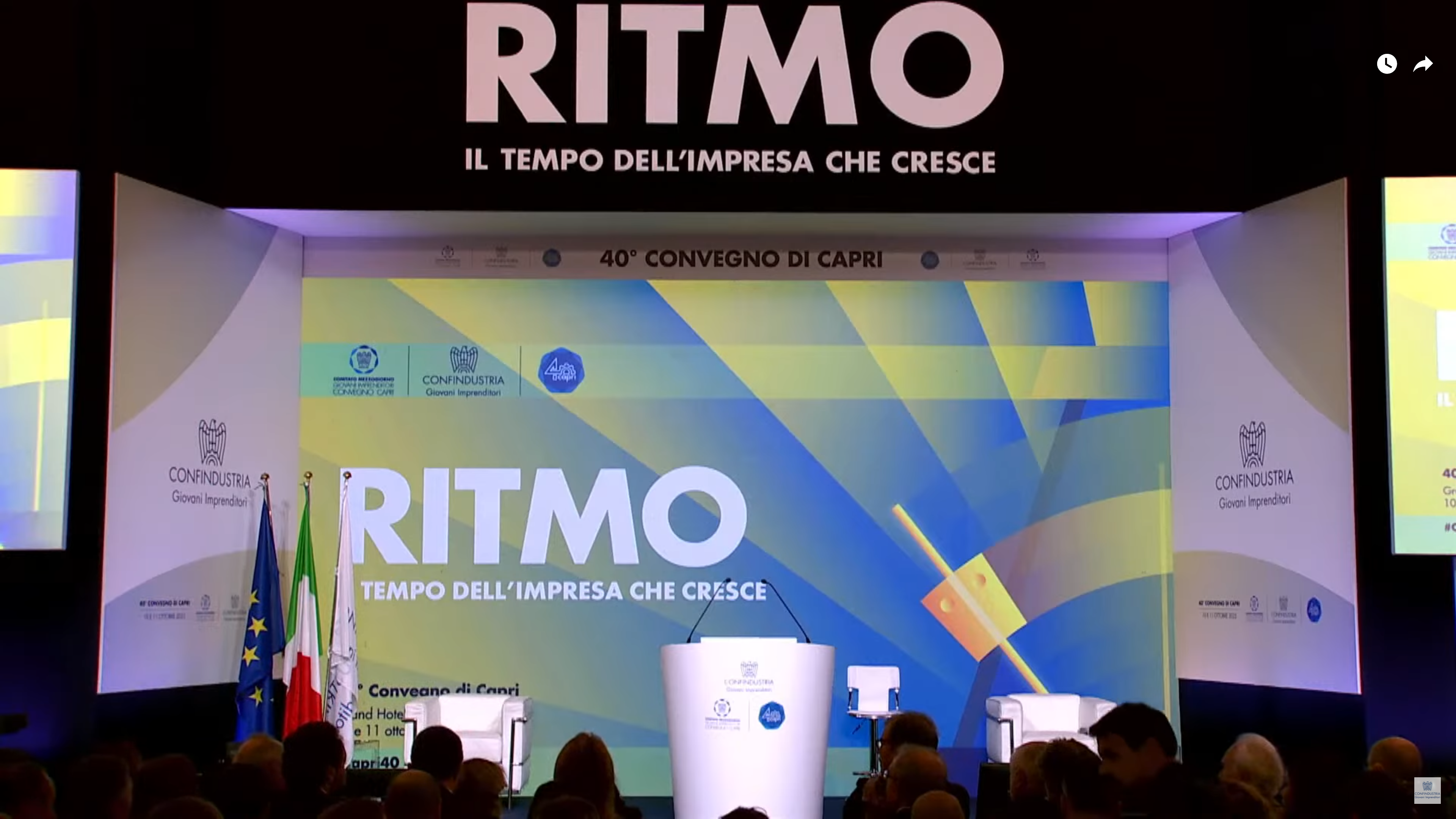
conference visual
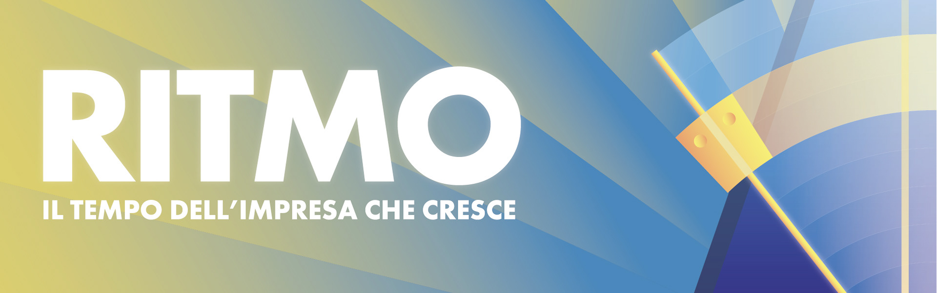
The visual identity translates the concept of rhythm through a symbolic object: the metronome. The illustration draws inspiration from Giacomo Balla’s celebrated work “Dinamismo di un Cane al Guinzaglio”, an emblematic piece of Italian Futurism. As in the painting, the goal is to evoke a sense of movement, speed, and dynamism - qualities that define both Futurist art and contemporary entrepreneurship. Curved shapes, broken lines, and vibrant colours directly reference the Futurist aesthetic, rich in energy and visual vibration.
The metronome becomes a perfect metaphor for representing the time of enterprise, its ability to set the pace for development and innovation.